A declaration of love to the em dash: Regarding the Em Dash.
And a discussion on using the em dash and other punctuation, also considering TeX: on Hacker News.
About questions regarding typography and typefaces.
A declaration of love to the em dash: Regarding the Em Dash.
And a discussion on using the em dash and other punctuation, also considering TeX: on Hacker News.
From time to time it is necessary to manually correct the spacing between two letters, i.e. to add some extra kerning. The macro to add this kind of horizontal space is \kern followed by the amount of spacing Since it is a TeX primitive the “argument” must not be in braces and the trailing space is optional.
Example
|
1 2 3 4 5 6 7 8 |
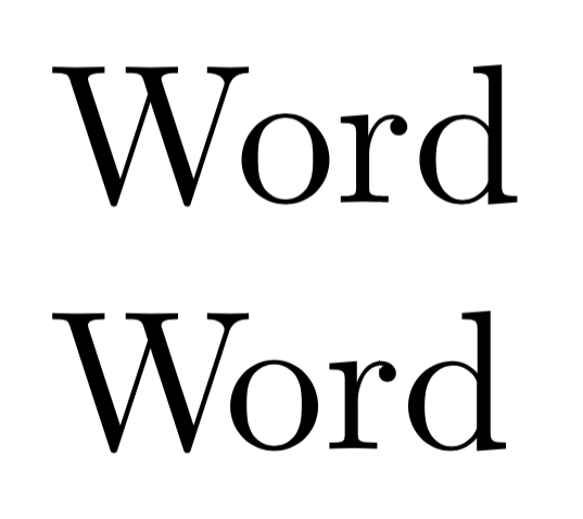
\documentclass{scrartcl} \begin{document} Word W\kern-0.14em ord \end{document} |
The following image shows the result: The upper line uses the natural kerning with too much space between letters W and o and the lower line shows the manually correction.

It is suitable to use a font-size-relative length unit like em.
Of course this would be lot of work to do but it is a good idea to at least do it for titles, headlines and such. Furthermore there are typefaces/fonts requiring more corrections than others …
In TeX 1pt (TeX point) is defined as 1/72.27 inch. Many other applications like Word and Adobe InDesign etc. however use a slightly bigger point – defined as 1/72 inch – the DTP or PostScript Point. In TeX this unit is named Big Point: 1bp.
You may download a complete list of available units from my website: Length units in TeX (1.25 MB; direct download)
When you change the font size with commands like \Large inside a group you must end the paragraph either with a blank line or \par before the group ends to get the right line spacing.
|
1 2 3 4 5 |
WRONG: {\Large some large Text} Normal sized text |
|
1 2 3 4 5 |
RIGHT: {\Large some large Text\par} Normal sized text |
TeX always uses the baseline skip settings of the site active at the paragraph end, which is actually \normalsize in the first code.
To highlight text don’t use \textit but \emph, because the latter also provides the right logical markup (“emphasize”) and takes care of nesting.
|
1 2 3 4 |
\emph{This is some example text which is emphasized by using an italic font. A \emph{nested highlighted} will be recto (upright)}. |
Did you know that \bf, \it, \rm, \sc etc. are deprecated and should not be used with LaTeX? They don’t allow to be combined and therefore it is recommended to use the new commands like \bfseries, \itshape etc. For short text to be formatted there are also the \textXX{text} versions:
|
1 2 3 4 5 6 |
This is some \textit{short italic} text. {\itshape This is a larger section in italic. } |
Load the bm package in your preamble. Do this after all packages, which define symbol fonts. If you are not sure about this, place this line below all font packages:
|
1 2 |
\usepackage{bm} |
Declare a command for each bold symbol:
|
1 2 3 |
\bmdefine{\balpha}{\alpha} \bmdefine{\bX}{X} |
Use the new macros in your document within math mode.