Images as TikZ nodes

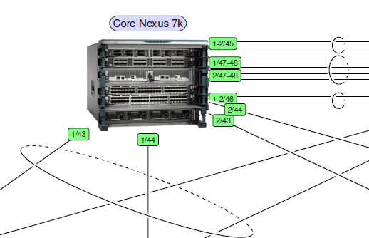
In diagrams, I need to include images, such as symbolic icons or photos of actual hardware. I defined a generic TikZ style with two arguments: the name of the image, and the desired width. The height comes automatically with the same aspect ratio.

For the final node style, I apply this style plus adjustments such as actual node width and x or y separation:

All style definitions above go into a \tikzset command, separated by comma, plus many more global styles I need:

This way I get photos with annotations for larger physical diagrams:

core-switch

Event tip: DANTE TeX meeting

Next week, the university of Wuppertal will host a meeting of the German language TeX user group DANTE. A great opportunity for meeting TeX friends! Of course, also non-members are very welcome.

The program includes several talks about LaTeX in and for schools. Unknown features of CTAN will be presented, and we will see demonstrations of practical tasks, such as: converting a CEWE phot book to PDF using LaTeX, writing job aplications, and typesetting exams.

For detailed information about registering, travel, program and accomodation, see: http://www.dante.de/events/dante2016.html.

Paragraphs – the right way

in LaTeX the only two regular ways to end a paragraph are an empty line or the \par macro. Thus

and

is basically the same.

Please do not use \\, \newline or anything else to “end” a paragraph; it is considered to be bad style and actually wrong: From LaTeX’s point of view this only ends the line but belongs to the same paragraph. Therefore the indention or skip between paragraphs can’t work properly.

Prefer \emph over \textit

To highlight text don’t use \textit but \emph, because the latter also provides the right logical markup (“emphasize”) and takes care of nesting.

Forget about \bf and the like

Did you know that \bf, \it, \rm, \sc etc. are deprecated and should not be used with LaTeX? They don’t allow to be combined and therefore it is recommended to use the new commands like \bfseries, \itshape etc. For short text to be formatted there are also the \textXX{text} versions:

Automatic correction of widths in the table of contents

The default widths of numbers in the ToC are static. This can lead to problems with large sectioning numbers as well as large page numbers. It’s even more relevant for Roman numbering, where the width of numbers is even wider. In such cases, numbers and textual entries of the ToC may overlap.

You can fix this easily by:

Getting bold math symbols

Load the bm package in your preamble. Do this after all packages, which define symbol fonts. If you are not sure about this, place this line below all font packages:

Declare a command for each bold symbol:

Use the new macros in your document within math mode.

Removing page numbers

The traditional way to avoid displaying page numbers is using the command \pagestyle{empty}. Another way, which also omits pane numbers in the table of contents, is:

If you use hyperref, check that required hyperlinks still work.